Simply the Best
A corporate identity that breathes construction sites: sharp-edged type, signal orange on concrete grey and diagonal cuts that carry robustness, precision and pace.
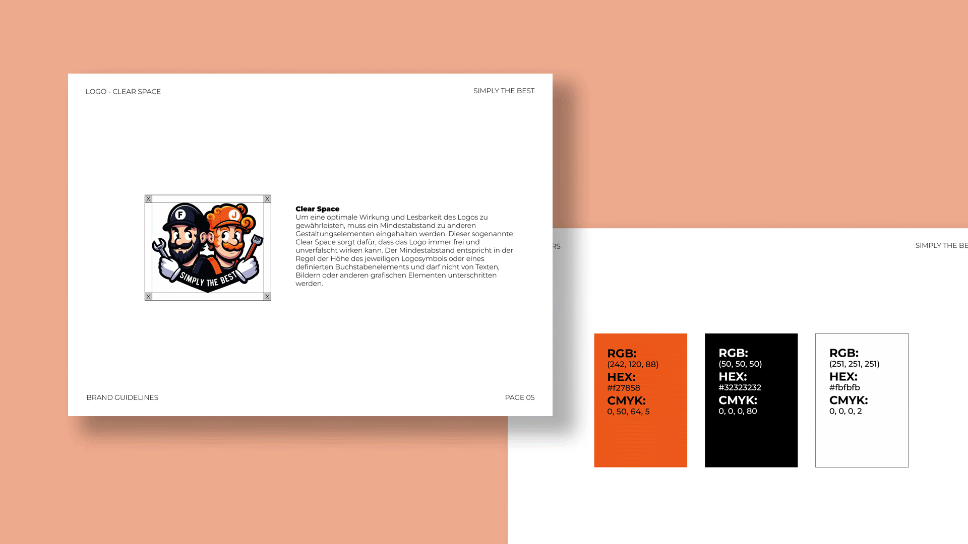
When the demolition hammer bites, the wordmark has to hold. Simply the Best was looking for a visual signal that conveys robustness, precision and pace as clearly as a freshly exposed steel beam.
From the site into the image
From the first scribble to the final colour world, an identity took shape that breathes construction sites and works just as strongly on vehicles, on signage and in the feed: sharp-edged type without flourishes, dynamic diagonal cuts echoing the cut edges, like a site stamp. Signal orange meets concrete grey, black outlines set clear edges, fine grids recall floor plans. The result is robust, tidy and instantly recognisable, exactly like clean strip-out work.